Sunday, September 30, 2012

Christoph Angehrn - Fight - Critique


I think shot 4 works well in the cut, the only thing that cuts weird is the camera movement. Meaning, in shot 4 the camera is still and in shot 5 it's tracking and tilting. I would start moving in the camera towards the green guy ever so slightly in shot 4 and slow down the camera at the beginning of shot 5, so that the motion carries over in a subtle way.

The expression of shot 3 I'm not too sure about. He feels more like a movie creature, that roars before an attack. It makes him look really animalistic and not human. :)
Is that the intention?

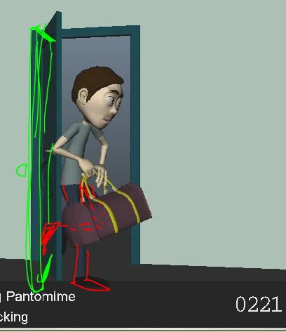
Overall though it's coming together, my only change would be for the last shot (don't forget to include frame counters, the last one has it missing).

After his jump he punches the guy, but that move feels really odd because there's a direction change in mid air, which doesn't really work:


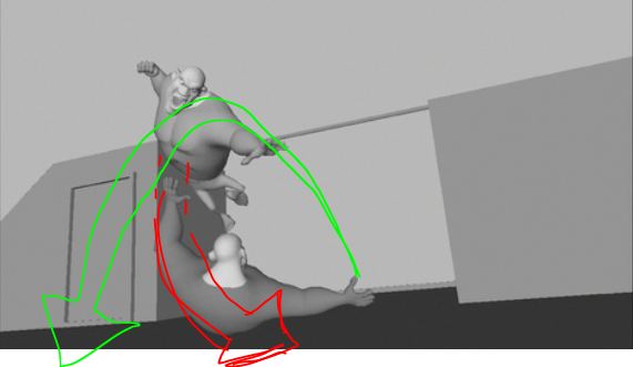
If you look at the arc of the jump, he would end up where the point of my green arrow is, yet he suddenly moves SR for no reason. In order to make it work with the position of the punch (before he lands on the guy and slides SR (that direction change makes sense because of the body contact)), you will have to move him over to the right and flatten the visual Left to Right arc:


I hope my crappy drawings make sense. :)

If you have an overall controller that moves the whole guy, you could counter that move to the right, so that you don't have to go back into his animation. What do you think?

JD


Friday, September 28, 2012

Arthurnal - girl fight and cockroach - Critique


I think the first shot looks awesome! I don't have that much to say, it's look really really cool! My only tweaks would be:

x75ish, on that pose, her left arm is behind the sword and it makes for a muddled silhouette. I would bring out the arm and put it higher:


- when she jumps up, it feels like she jumps and then sticks in the air; if possible, continue her upward arc:


- when she gets grabbed, even though it's a fast move, I would drag her upper body and especially her head a lot more; so from x142 to 143, on 143, the head would be tilted way towards the pose she had on x142:


- when she's on the ground and about to get stepped on, she feels a bit stiff when looking up (I know you would after such a slam but still, hahaha); I would tilt her head up more, and I would also spread her left hand's fingers, so she doesn't push herself up with her fist:


- after the roll back, she's in a three point landing pose, which is by now very cliched; you could argue that by having her left arm in front of the left leg it's not looking like a three point pose, sure, but if you had to go for that pose, I would at least bring the arm in:


Again, it's not my favorite pose, but at least she's not jumping and landing, it's more a roll and getting into that pose. But what I would try, if you have time, is to bring her right arm down on the ground, to make it messier. I don't think she has to have a "cool" pose at this point. She was almost stepped on, she has to regain the upper hand, so by having at that point a messier pose and not so heroic, you make the audience think "Oh, she's not that cool looking anymore, is she actually going to get defeated?". But then she powers forward and slices the guy and all is well again. So that little misdirection could be cool. What do you think?

All in all though, it's looking very cool!


For the cockroach shot, I thought that the look was great (did you model all of the set?). As you mentioned, fix the two things listed but I have some other points, seeing this render:

- everything is fairly grayed out, but the skateboard is much darker and therefore stands out; on top of that the edge is right where his leg is, forming an odd visual tangent. I would grey out the skateboard a bit more and move it a tiny bit to the left:


- with the new set, the cockroach is hidden by the bag while it enters the scene. I almost missed it and was looking at the guy until he reacts. I would have it enter higher in frame, so that we can clearly see that it's coming in:


- not sure if it's because of the render, but after he rolls on the chair, looking at the cockroach, he shakes a bit; seeing it now, I would amp up that shake, and make it a bit faster, it barely registers.

That's it otherwise! Really nice job!

Cheers
JD

Wednesday, September 26, 2012

Christoph Angehrn - Fight - Critique


 Hey,

glad to hear it was helpful!

Here some picky notes for you:

shot 1:
- staging wise, I'd move the green guy a bit over, so that the hand of the red guy is not covering him or forming a tangent:


For the fist, it's looking better, I would just give it a beat at the end with the fist closed. It feels like you're closing it and then there's immediately the cut. I think you want to rest on that fist a bit longer and give the audience enough time to read it.
And don't forget to do the same thing with the other fist (a bit off set of course, but it's a bit weird to have only one fist do all the acting). :)


shot 2:
- that one works a lot better, nicely done! His thought process is a lot clearer and I like the looks and pauses!
- my only comment would be at the end. It's as if you kept the motion but just changed the finger pose, meaning, they feel a bit disconnected. Having that finger pose indicates something smaller (since there's only one finger up), but yet you have a big hand waving motion. So to me they're fighting a bit. I'd tone the wave done and maybe just have the arm come up, finger up, and then do two little finger moves back? Something like that? Your call, but I think there's still room for a more distinct acting choice.


Cheers
JD

Yuri Perrini - Suitcase - Critique


Hey,

all is well, hope you're doing good too!

The idea of breaking up the shot into separate sections for polish is a great idea and I frequently do the same thing. Your shot is long so it can be daunting to refine everything. But it's looking good overall, don't be too frustrated. :)

The frame range you want to work on sounds good. I also go by the actions of the character. You mention the first 300 frames, but you could also go up to x342, since he stops pulling and goes into a new action. Totally up to you, it's just something to think about if it helps.

The camera movement works and helps us getting a good look at him, nicely done!

As you start splining and refining the timing, here some areas I'd tweak while you're at it:

- don't forget to keep a clean silhouette throughout the shot, so avoid any tangents:


 - there's the moment where he turns around the suitcase and leaves it tilted. Being so heavy, it feels like it should fall over during that section after the turn and until he gets ready to pull around x419. So maybe show that he's still holding it up, or better, have the suitcase start tipping over and he pulls it up a bit for balance. Would be very cool to keep showing the weight of it during that section:


- after the break-away pull, I feel that by x581 his root can be higher so that he's not so squatting in his steps. His legs are already long, so his bent legs feel a bit weird at that point, it's kind of a forced pose:


- lastly, I like the direction you're going for the ending, I'd just be careful with the pose at x815 and 817. It indicates that he's jumping to the right. So point him the other way so that the arc is correct.

Nice work!!
JD

Sunday, September 23, 2012

Christoph Angehrn - Fight - Critique


Ok, for the two new shots, here are my thoughts:

shot1:
- red guy steps in and makes a fist; I think the fist moment can be pushed a bit with a pause between those two moments, so on x341, I would wait 10 more frames, then make the fist and as you continue to add breakdowns, I wouldn't make the fist transition too fast; I think if you have that moment be more deliberate and slow, it will show us that this guy is really pissed and it's his goal to kick some ass, instead of just showing a succession of movements by having this guy step in and go directly into a fist post

shot2:
- when we see the green guys' face, before the wipe, are you planning on having him react to the red guy stepping in? Meaning, is his downward gaze going to go up, will he blink, will there be any facial reaction or is he totally concentrated and cold, like he knew already that the red guys is going to show up so that he just turns and goes "come here, let's do this"?
- the "come here" wave is a bit played out; I'm glad you didn't do the "Matrix" cupped finger/hand pose and it's more of a wave, but we could push this a bit more and give it a bit more character. What's the green guy's attitude towards the red guy? Is he confident he can kill him? Would the wave be a bit more relaxed and bored? Is the ready to fight but he secretly knows that he might not win? Would it be good then to have just one wave? A quick one? Or is he so strong that wants to play with him? Would he then not wave but just use his index finger, like a playful "come here little guy"?

I think overall all the ideas are in place, but it would be really cool to think about character moments even when the faces are not visible. You can still tell us about their character, just by seeing their body move, or just through a hand gesture.

What do you think?

JD

Tuesday, September 18, 2012

Ji-Hong Kim - Bee - Critique


Hey,

pretty much done, nice work!! I only have three things:

- at the very end, he exhales once, then breathes in until x2097, but after that he's still, with a tiny drift going up. Is he holding his breath? I don't mind continuous breathing, it just should not look like a cycle. So when you have this:


Inhale being pose A, exhale being pose B, you don't want to go up and down and up and down and just alternate between A and B. It should go from A to B, back up to C (a slightly different pose), then down to D (different again), and so on, for variety and contrast and to get rid of that cycle feeling.

Speaing of pose, I would have his left arm elbow lower, so a cleaner silhouette:


More like something you have on x2160. I think you had the elbow problem in the last version already and I should have caught that, sorry!

I also should have caught the third thing: the bee

- right now the bee goes up and kinda stops around x2028, as if it's waiting for the guy to grab it; it looks like the bee is getting caught on purpose. I would have her still go up fairly fast when he grabs her.


You could ask the question why is the bee not continuing to flee SR? Why is it stopping and going up? I think you could make it work if the bee coming in would feel a lot more tired and it's just not fast enough anymore. What do you think?

Actually one more thing but it's more of a shape thing:


It looks like he swallowed a thousand bees! :)
Not sure if that's fixable, it just makes for a funky silhouette. I wouldn't really expect a fat throat on a skinny guy. :)

Almost there though!!

Cheers
JD

Saturday, September 8, 2012

Nancy Lai - Creature - Critique


Hey,

overall this looks GREAT!!! LOVE IT!! You made fantastic changes to it!

My only tweak would be to have something like this:


The first time I watched it, the only thing that felt strange was he was jumping up onto bridge, while she's running away. You could argue that he wants to use the bridge to swing further forward to catch her. But I think it would be cool to add one more thing prop wise that really motivates him to get onto that bridge.

So I wouldn't change the camera and anim wise, the only thing that would need some tweaking is from x187 to 201, how his right arm goes back. It's cool how he's pulling himself forward, but if a car is underneath the hand, it would look like he's pulling the burning bar towards him. The hand would have to lift off first and then get onto the ground.

Other than that, I think it's great and your stumbling idea you mentioned for her is a good idea.

If you're okay with that car change, we can start attacking the shot anim wise to refine it. There's a lot of work in it and I would suggest you cut the shot into separate sections. A good first chunk to work on would be from x1 to x100, then from 101 to x185 and then from x186 to the end. These are rough numbers but it feels like during those sections you have separate beats (looking mainly at the creature). Of course that's just a suggestion.

What do you think?

JD

Friday, September 7, 2012

Ji-Hong Kim - Bee - Critique


Hey,

looking good! My only thoughts would be:

- after x1904, he moves suddenly super fast to the right. I'd add a few more inbetweens so it's not so super zippy


- watch out for the foot pose from x1945 to 1948. The foot is rotated at the same angle throughout, so it feels stuck in that pose


- on the plant, I'd move the foot a bit more forward


So on x1948, move the foot a bit more screen left, based on how the foot would fall on x1947 (above pic)

- The pose on the foot on x1950 could have more of a foot roll in it, so it doesn't feel so stiff:


- and one frame later, it feels like the legs go a bit too far over one frame, which gives it a poppy feel:


- even though you have a moving hold after x2004, I feel you can add one more distinct move on x2005 that transitions into the hold; right now he comes to a fairly abrupt stop


- the grab after that I would delay to around x2031ish, so that it's more in sync with the music; same with the last pose around x2064; right now they both feel too early

- I'm assuming it's breathing around x2085, but he moves down a bit too quickly, it doesn't feel like heavy breathing or even a forceful exhale, it starts too quickly

Almost there!
JD

Sunday, September 2, 2012

Katrin Albrecht - Bag - Critique


 Hey,


This is looking pretty good, I like where you're going with this! And the order of things, what he does and when he picks things up works great.

My overall comment would be that you could speed the whole thing up. In quicktime I watched it twice as fast and it still worked. Sure, there were moments where pose changes popped because of the new speed, but overall, it still worked. That was my first impression, that it was a bit dragging overall.

The other thing was posing. As you continue you will have to make sure that the silhouette is always working:


So for instance, on that frame, you wouldn't have his arm aligned with the outline of the body and bleeding into the line of the leg. My horrible drawings are probably more confusing than helpful.


Also, watch out for poses like the above one, where he looks very relaxed and normal. I'd make sure to always have some back and shoulder strain. So, shoulder up and back arched back to emphasize that feeling.

There are also some cool moments which get almost lost, like here:


I like how he uses his foot to open the door, but that moment is very fast and silhouette wise we almost miss it. I'd take those details and key moments from the reference and push it, timing wise and pose wise so that they're more readable.

But again, it's a great start! You're on the right track!
JD