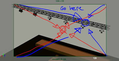
Hey,
here my thoughts:
First shot:
- you're not quite framing the way I suggested it, which leads the staging to a weird focus to the middle of the gray background. You'd have to pan the camera to the right and tilt up a bit, so that we are clearly following the bee (maybe you have to extend the shot a bit so that you have two clear beats of showing the environment and the conductor and then the bee enters and we are following it):
2nd shot:
- the feet feel very simple and more in layout stage from x47 to 79. They can change poses during the flight and then adjust to get ready for the landing.
- the landing feels too simple; I know bees are light and there wouldn't be a crazy compression, but some leg adjustments and tiny steps will help; it will also help to get out of that default shape where right now on x79 all legs are evenly spaced
3rd shot:
- good
4th shot:
- given that we just zoomed in, you'd think that the bee is reacting immediately to the discovery of the flower: that's what the zoom in does; right now you're emphasizing the flower but cut to a bee that is still looking around and then suddenly seeing something. You can rearrange the shots though to make it clearer.
So the top clip is the original and I just took the flower close-up and inserted it into the bee close-up, between the looking-around and realizing-what's-there moment.
- bee face wise, the mouth shape, wings and head feelers are a bit even and they could be more asymmetrical, don't mirror the poses:
5th shot:
- it's overall pretty great, the only tweak would be when it gets up until around x324. The orientation of the bee body is always the same. There is a sideways tilt at the end, but given the perspective and axis, we can barely tell. You could rotate it clockwise so that the head and chest go up a bit more:
Hope this helps!
Cheers
JD


No comments:
Post a Comment