Sunday, December 16, 2012
Sunday, December 9, 2012
Saturday, December 8, 2012
Tuesday, December 4, 2012
Friday, November 30, 2012
Saturday, November 24, 2012
Thursday, November 22, 2012
Monday, November 12, 2012
Thursday, November 8, 2012
Sunday, November 4, 2012
Saturday, November 3, 2012
Sunday, October 28, 2012
Saturday, October 27, 2012
Friday, October 26, 2012
Sarah Knight - Ice - Critique
Hey,
I like what you did with the beginning! Her arms crossed as she walks up to the ice is a nice pose.
Once she prepares herself for the ice, I'd tone down the SR arm on x72:

... and not got out so far. By having the arm not so far out it gives you room to go to the pose on x87.
- when she's steadying herself, I'd bring up the wrists more, like on x160:

... to give it more of a "careful" look/pose, instead of having her hands just hang down. If possible, I'd also scale down her hands by 20%.
- watch out for linear timing, like from x137 to 170. To me, at this point, she'd be a bit more careful and her straightening of her back would be slow, but still with more contrast in timing. Right now she looks down and moves up in a very even and robotic way. She can start slow and then ramp up a bit, so you'll give contrast to the overall pacing. Remember that your blocking has to clear in terms of ideas, acting and timing, not just showing the poses. How long it takes to go from pose to pose tells us how she feels. A quick straightening tells us she's in a hurry, or got scared, a slow straightening could mean she's careful, or tired. But if you make transitions to even, then she'll feel like a robot.
- the big slip from x195ish to 247ish has her head pretty level. I'd vary the head orientation to gradually have her more out of control, by having side to side tilts and bigger up/down rotations
- on the last drop, I would exaggerate the arc and give her more hangtime after x250:

... right now, she arcs back and then suddenly drops down
- once she's on the ground, I'd pause a bit longer while her eyes are closed:

... her face could be in a lot of pain. So hold that for a beat and then the ice cracks and THEN she opens her eyes
What do you think?
JD
Saturday, October 20, 2012
Arthurnal - Music - Critique
Alright, that looks already very promising!
I know it's a detail thing, but I like his hair. :)
Speaking of detail, the eye highlight is a bit funky, since the white highlight is not in the same spot for both eyes:

It gives him a cross eyed look.
- At the very beginning, the eyes dart to the right and then back to the left. I would have only one side in there. I you have eyes darting left and right too fast it looks like a pinball machine. He looks crazy with his eyes darting around. Simplify!
- same thing from x30 to 48. I like the reaction, but again, his eyes dart around left/right/left/right
- on "section", around x99, you have him look down and to his left. This feels strange to me because during this section of the dialogue he's explaining to the invisible guy what happened. So to me he's focused and should be making constant eye contact. I wouldn't have him look away.
- on "music" you bring his hands up:

I'm not too sure if that pose is working. What's the story point? What is that hand pose supposed to tell the audience? Is it enhancing the dialogue? And as he goes back, he keeps both hands up for a while. So you're starting to repeat the poses and he looks more like he has handcuffs on. This part is the one that works the least for me (only the hand part).
- the ending works because it's much more subtle and I like how the small movements reflect how helpless he is and that something perfect doesn't need grand gestures. Not sure if I'm making sense, but I like it. :)
Great first pass though!
JD
Tuesday, October 16, 2012
Sunday, October 14, 2012
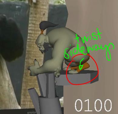
Raluca Feresteanu - Fire Hero - Critique
Hey,
that's looking awesome!!! Super cool blocking, I love it!! Great to see how you went with that idea!
My only two concerns are for the beginning and the end. So:
- at the beginning, when he comes down from the wall, he's covered by the tree a lot. I would bring him more to the right, into the empty space. Maybe put the tree a bit more to the left, or do both, but whatever you can do to make him more visible.


- the other part is at the end, once he pushes off the big tree, he steps over her face and has the foot in front of her. That feels a bit awkward to be standing over her and potentially stepping on her face. :)
I would have him behind her at all times. The tree can still fall down to the left, but maybe a bit more diagonally, so that he can stand behind her and still grab the tree? I hope that makes sense.


- and to elaborate more on the beginning, I would add another tree to the right,

so that his choice of breaking through the trees makes more sense. Otherwise he could just go screen right, around the tree and to her. With all that empty space SR, why kick the tree SL?


so that his choice of breaking through the trees makes more sense. Otherwise he could just go screen right, around the tree and to her. With all that empty space SR, why kick the tree SL?

And the camera is fine, the angle works for me. Would be cool to have some handheld feel to it, but I would worry about that at the end. What Maya are you using? You can send me this file and I can play around with the camera feel so I can show you a playblast for reference. What do you think?
Cheers
JD
Arthurnal - Girl Fight - Critique
Hey,
Your shot though looks absolutely awesome! And since it looks so awesome, I'm going to be super picky. :)
First off, the effects you added are very cool and it's something I wanted to do on future shots for myself as well. So you're a great motivator to go in that direction! How did you go about adding the effects? My route would have been to draw individual frames in photoshop and to add them to poly planes as textures one by one.
The most successful effects are the sword streaks and the sparks resulting from the spark blows. The robot punch streaks are mostly okay, but there are few I would tone down by a lot.
- the first punch I would tone down by a third
- 2nd punch tone down by half
- third punch keep the way you have it; that intensity needs to be so big and bigger than the first two because it's forcing her biggest reaction as well (jumping away from him)
- 4th move slamming her down: x162 tone down by half, x163 by a third, add effect on x164 as big as original x163, keep x165, make 166 twice as big and x167 as big as original x166. Her ground impact needs to be more prominent with the effect.
- 5th move, his stomp, would tone down by 60%
- 6th punch on ground I would reduce the streak in the air by 50% but add a bigger on the ground, more horizontal than vertical


Animation wise here my thoughts:
Robot
- on her sword strike at around x115, I would clench his fist (left hand in frame) to show some reaction to that sword blow
- after the punch on the ground around x222, the robot just stays put and kinda waits for her to cut off his arm; I would add some business to him, an adjustment to make it less static
- when his feet are in the air, I would rotate the fingers in


- and on the plant, you can bring them out again and to the side, to show the pressure of the foot and the squash


Woman
- for a cleaner silhouette I would have the blow on x258 end more screen left, so it's not hidden in front of her left leg


- for the ending I would have her keep the sword up until the robot is fully down, in a cleaner and more dynamic pose, more dynamic than my crappy drawing, hahaha

and then have her go into the sword down pose after x310. It's a bit rushed at the moment.

and then have her go into the sword down pose after x310. It's a bit rushed at the moment.
Hope this helps!
JD
JD
Tuesday, October 9, 2012
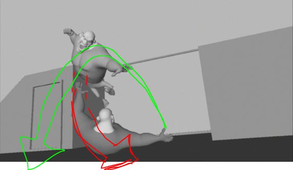
Raluca Feresteanu - Ogre - Critique
Hey,
alright, here my thoughts on the shot:
- first off, I think you did a great job incorporating the reference into your animation, but I would turn the ref plate off and tweak the anim from there. Some moves, even if they match the plate, can look a bit funky.
- watch out for the beginning pose changes. From x1 to x9 it moves a bit pose to pose, where everything starts and stops at the same time; it almost feels like a dance move.


- his left arm pops a bit during the up down move around x21. I would slow that move down a bit.


- from x38 to 43, I would ramp up the drop of his root, to add a bit more weight. The chimp is smaller and lighter than what this ogre looks like, so we have to push the timing here and here
- from x36 to x43, I would rotate his right first towards his body a bit (you can try to keep the fingers down); right now it gets into IK land, where the arm/elbow is moving a lot, but the fist isn't; it also gives it a broken wrist look at x43.


- his right fist around x54 could have stronger contact with the rock; it feels a bit floaty


- I know that's not your fault, but the geometry has some funky deformation at x59 in the hip/back/belly area; maybe you can tweak the hips for a nicer shape?


- on x64, his right foot could have a bit of foot roll dialed in, so that the shape down his leg to his foot is less of an L.


- I would ease out of the rock grip a tiny bit on x86 to 87 (his right arm), it's a bit too linear in spacing and slow it down a tiny; might be the distracting ref plate popping in/out, but it fees like that big arm is moving really fast down to x92


- looking at his left foot from x93 to 101, I would introduce more sideways tilt, so you get rid of the IK feel and broken ankle look

- around x111, the thumb pose is too mirrored and looks a bit weak, I would lower the screen right one


- his root has a sudden forward acceleration from x123 on, which feels like a pop; it also drags the feet forward (screen right) too fast, so smoothing out that root movement will help a lot with the overall feel of the swing hang time and direction change
- his left elbow pops from x136 to 138

- his left elbow pops from x136 to 138

- same too fast direction change from x148 to 149 and then 150 (sudden screen right move from x149 to 150); the root also stops its screen right movement super abruptly on x151 to 152
- his right foot also moves too fast from x143 to 145; there's small spacing before that, then visually the foot covers a lot of ground over two frames and then suddenly small spacing again, which makes it look poppy


- visually, his right arm pops away from x162 to 163; it have one more frame with just half of the hand and some fingers behind the tree


Hope this helps!
Cheers
JD
Friday, October 5, 2012
Ji-Hong Kim - Bee - Critique
Hey,
here my thoughts on the three shots:
- on the first one, it's like the previous ones, you have make sure that his stick waving arm follows nice arcs, otherwise it looks too rough and stiff:

- same goes for the other arm. Also, watch out that your keys are not linear. His left arm moves up quite a bit from x977 to 978

- looking at his body, if you focus on his bow tie as well as his shoulders, there's a poppy move up from x1005 to 1006 and then it goes straight to the right to x1007 and stops. I would soften that direction change a bit and add a frame or two of ease in for the body. I understand that you want him to suddenly react, but right now it's on the poppy side. A frame or two will help soften that just enough without making it too soft:

- at x1024, his right arm stops very abruptly, so same here, ease into that stop more (and watch out for your arcs):

- for the 2nd shot, it looks like the bee is on a flat card and just moves up; I'd give it more perspective and have it rotate in. It doesn't have to a spiral like in my drawing, but at least a bit of a turn:

- and I wonder if you want to make the bee freak out a frame or two before the hand closes in so we can barely see it. :)

- after x1072 the animation is dead, I would still move the hands/arms a bit more; the hands could go up as much as a finger width. If that's too much you can always lessen it, but for now I'd push it
- for the last shot it's a combination of the previous notes; watch out that the arms move on an arc and not on such a linear path; the bee just slides down, it could rotate a bit to give it more dimension; make sure you soften the start and stop of his arm movements for more ease in and out, otherwise it looks too blocky; and offset the timing of when the arms move, so one is delayed a bit for less of a pose to pose look:

- and lastly, move out the SR arm so that the thumb doesn't form a tangent with the shoulder and it will help the silhouette as well as minimizing the twinned/mirrored pose of his arms

Hope that helps!
JD
Sunday, September 30, 2012
Christoph Angehrn - Fight - Critique
I think shot 4 works well in the cut, the only thing that cuts weird is the camera movement. Meaning, in shot 4 the camera is still and in shot 5 it's tracking and tilting. I would start moving in the camera towards the green guy ever so slightly in shot 4 and slow down the camera at the beginning of shot 5, so that the motion carries over in a subtle way.
The expression of shot 3 I'm not too sure about. He feels more like a movie creature, that roars before an attack. It makes him look really animalistic and not human. :)
Is that the intention?
Overall though it's coming together, my only change would be for the last shot (don't forget to include frame counters, the last one has it missing).
After his jump he punches the guy, but that move feels really odd because there's a direction change in mid air, which doesn't really work:
If you look at the arc of the jump, he would end up where the point of my green arrow is, yet he suddenly moves SR for no reason. In order to make it work with the position of the punch (before he lands on the guy and slides SR (that direction change makes sense because of the body contact)), you will have to move him over to the right and flatten the visual Left to Right arc:

I hope my crappy drawings make sense. :)
If you have an overall controller that moves the whole guy, you could counter that move to the right, so that you don't have to go back into his animation. What do you think?
JD
Friday, September 28, 2012
Arthurnal - girl fight and cockroach - Critique
I think the first shot looks awesome! I don't have that much to say, it's look really really cool! My only tweaks would be:
x75ish, on that pose, her left arm is behind the sword and it makes for a muddled silhouette. I would bring out the arm and put it higher:

- when she jumps up, it feels like she jumps and then sticks in the air; if possible, continue her upward arc:

- when she gets grabbed, even though it's a fast move, I would drag her upper body and especially her head a lot more; so from x142 to 143, on 143, the head would be tilted way towards the pose she had on x142:

- when she's on the ground and about to get stepped on, she feels a bit stiff when looking up (I know you would after such a slam but still, hahaha); I would tilt her head up more, and I would also spread her left hand's fingers, so she doesn't push herself up with her fist:

- after the roll back, she's in a three point landing pose, which is by now very cliched; you could argue that by having her left arm in front of the left leg it's not looking like a three point pose, sure, but if you had to go for that pose, I would at least bring the arm in:

Again, it's not my favorite pose, but at least she's not jumping and landing, it's more a roll and getting into that pose. But what I would try, if you have time, is to bring her right arm down on the ground, to make it messier. I don't think she has to have a "cool" pose at this point. She was almost stepped on, she has to regain the upper hand, so by having at that point a messier pose and not so heroic, you make the audience think "Oh, she's not that cool looking anymore, is she actually going to get defeated?". But then she powers forward and slices the guy and all is well again. So that little misdirection could be cool. What do you think?
All in all though, it's looking very cool!
For the cockroach shot, I thought that the look was great (did you model all of the set?). As you mentioned, fix the two things listed but I have some other points, seeing this render:
- everything is fairly grayed out, but the skateboard is much darker and therefore stands out; on top of that the edge is right where his leg is, forming an odd visual tangent. I would grey out the skateboard a bit more and move it a tiny bit to the left:

- with the new set, the cockroach is hidden by the bag while it enters the scene. I almost missed it and was looking at the guy until he reacts. I would have it enter higher in frame, so that we can clearly see that it's coming in:

- not sure if it's because of the render, but after he rolls on the chair, looking at the cockroach, he shakes a bit; seeing it now, I would amp up that shake, and make it a bit faster, it barely registers.
That's it otherwise! Really nice job!
Cheers
JD
Wednesday, September 26, 2012
Christoph Angehrn - Fight - Critique
Hey,
glad to hear it was helpful!
Here some picky notes for you:
shot 1:
- staging wise, I'd move the green guy a bit over, so that the hand of the red guy is not covering him or forming a tangent:

For the fist, it's looking better, I would just give it a beat at the end with the fist closed. It feels like you're closing it and then there's immediately the cut. I think you want to rest on that fist a bit longer and give the audience enough time to read it.
And don't forget to do the same thing with the other fist (a bit off set of course, but it's a bit weird to have only one fist do all the acting). :)

shot 2:
- that one works a lot better, nicely done! His thought process is a lot clearer and I like the looks and pauses!
- my only comment would be at the end. It's as if you kept the motion but just changed the finger pose, meaning, they feel a bit disconnected. Having that finger pose indicates something smaller (since there's only one finger up), but yet you have a big hand waving motion. So to me they're fighting a bit. I'd tone the wave done and maybe just have the arm come up, finger up, and then do two little finger moves back? Something like that? Your call, but I think there's still room for a more distinct acting choice.

Cheers
JD
Yuri Perrini - Suitcase - Critique
Hey,
all is well, hope you're doing good too!
The idea of breaking up the shot into separate sections for polish is a great idea and I frequently do the same thing. Your shot is long so it can be daunting to refine everything. But it's looking good overall, don't be too frustrated. :)
The frame range you want to work on sounds good. I also go by the actions of the character. You mention the first 300 frames, but you could also go up to x342, since he stops pulling and goes into a new action. Totally up to you, it's just something to think about if it helps.
The camera movement works and helps us getting a good look at him, nicely done!
As you start splining and refining the timing, here some areas I'd tweak while you're at it:
- don't forget to keep a clean silhouette throughout the shot, so avoid any tangents:

- there's the moment where he turns around the suitcase and leaves it tilted. Being so heavy, it feels like it should fall over during that section after the turn and until he gets ready to pull around x419. So maybe show that he's still holding it up, or better, have the suitcase start tipping over and he pulls it up a bit for balance. Would be very cool to keep showing the weight of it during that section:

- after the break-away pull, I feel that by x581 his root can be higher so that he's not so squatting in his steps. His legs are already long, so his bent legs feel a bit weird at that point, it's kind of a forced pose:

- lastly, I like the direction you're going for the ending, I'd just be careful with the pose at x815 and 817. It indicates that he's jumping to the right. So point him the other way so that the arc is correct.
Nice work!!
JD
Subscribe to:
Posts (Atom)