Tuesday, June 26, 2012

Edwin De Loor - Baseball and Reach - Critique


Alrighty, here we go.

First off, usually animators send me one clip. If there's more (and that's fine), it will take longer feedback wise. Just a heads-up.

Let's take a look at the baseball pitch:

- I'm a bit confused about that one, since it looks so similar to the last version. It will also help to get a little bit of history regarding the shot and how far you want to take it.

- there are two things that stand out the most upon initial viewing:
> the way the root moves up after the throw
> the way the shot ends

As mentioned earlier, you want to make sure that the shots you work on look like they're taken out of a sequence, meaning, it should feel like something happened before and that something will happen afterwards.
Right now it ends like a robot is being shut off or the actor is waiting for the director to yell "Cut!".
So for the ending, think about what the character is going to do after the throw. It doesn't have to be another action, but just the beat will be enough, so that you can cut on action and not after all the movement is stopping.

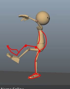
The other thing is the root movement from here:


 to here:


The timing and spacing of the SL leg and the root feel even and slow. The sense of weight could be stronger.
The back leg and the head also rise at the same rate, giving it a weird mirrored look.

There's a lot of forward momentum being generated by the swinging arm, yet all that momentum and speed dies off once you raise the root with the leg at that speed. And after that movement you have him get to this pose:


... by having the leg come down and the body rotate up, but without any weight shift.

I'd recommend to bring his right leg forward and down a bit sooner, so that after the throw the body has to take a while to stop that forward momentum and the imbalance forces him to bring his right leg forward. But once it's forward and down you have to put the weight on it. Right now it doesn't look like he's putting the weight on the right leg. I would flatten the foot, adjust the hips (SR side goes up since the weight is on that side) and at the end bring the root SL for the balance adjustment.


- watch out for arcs; for instance the SL arm (his right) going up until x9 and then suddenly down. That looks like a linear key.


- for the antic pose at x14, I would push the hip more; don't have his left hip be in line and right in front of his right hip ball, twist it more around and raise it:


- his shoulders could start to move up a tiny bit from x4 to 11, so that they're more influenced by what the arms are doing

- his left leg seems to travel in a flat arc from x16 to 24, which gives it an IK look. Counter that with more of an arc.


- watch out for line of action and try to avoid angular poses, like this:


I would tweak it so that there's more of a flow between the legs and the body.

Start with this, as some of the notes will change the anim pose wise and timing wise quite a bit. Later on we can go into more detailed aspects (like foot polish, etc.).


Ok, let's take a look at the "Reach" clip.

You mention that this is still in progress, so I'll give you my initial broader impressions.

- biggest thing that stood to me were his arms, especially at the end. They felt very IK-ish. This is mostly due to the even timing (mostly when he lowers his arms) and how the wrist rotations feel detached from the forearm. Wrists usually stay in line with the forearm, unless there is some dramatic overlap or drag or something else that asks for it. But the moment you have an arm drop, where the arm is changing orientation, and the wrist stays in the same rotation for a few frames, it's an IK give away. Same goes when you track the path of the wrist and it's moving in a straight line as opposed to a clear arc. That's another give away.

- as you continue, make sure that you have the proper ease in and outs, so for instance, as his left leg goes up, it comes to a very abrupt stop at x56, as if it hit an invisible wall


- same goes for full extensions of arms and legs; right now you pop into those poses, so they will need softer ease ins/outs as well


- another thing are his hips. Take the move from x39 to x49. Despite the movement and balance shift during that section the hips don't get affected at all, so watch out for that.


So overall, it's on the right track, it's just fine tuning arcs, adding the proper weight shifts and finessing the timing here and there. You're on the right track!

Hope this helps!
JD

Elena Dae - Cats - Critique


That's very cool, I like it! It's less poppy and more focused, nicely done!

Here my thoughts on it!

- the changes are good, but watch out for excessive twinning now:


and:


and:


and:


You will have to vary the timing and offset the poses a little bit in order to avoid that.

- watch out for the ear flicks (which I like), they are a bit poppy around x275 to 286, and from x292 to 298. The shapes are big, so having them move into another pose within a frame feels too poppy.

- another poppy moment happens after x249, where the SR mouth corner pops back (ease into that stop more)


- shape wise, it also looks like she doesn't mouth the words "make HIM" ... "like IT", it looks like she just says "make" and "like"

- watch out how the SR knee pops up at x268 to 269; I'd soften that a bit, as well as the root stopping at 292 (add two frames of softening)

Hope this helps!
JD

Monday, June 11, 2012

Elena Dae - Cats and Jump - Critique


Okay!

Let's go shot by shot on the cat clip:
Overall it's a lot tighter, which is great, nice job! Here my picky thoughts:

shot1:
- the grip around the neck still needs some tweaking; after the initial pull up it drifts up and down; she wouldn't move the hand up that slowly with so much weight on her, so it's okay to keep it fairly still, but the neck geom really has to stick to that hand to make the grip look firm
- but what I'd do is have her hand and body of the male cat go up like you have it, but then come down a tiny bit; his body stops very abruptly from x25 to 26, where it doesn't go up anymore, and her wrist goes SR, so ease into that stop more and have it go down a bit; imagine you pick up a heavy bag, you wouldn't be able to stop on one frame and the bag sure wouldn't because of the momentum
- her SR hand, after the pull up, seems to float down; you can see how her thumb gets closer to her hips; you can stiffen that arm more, so that the eye doesn't wander there; the focus after the pull is on both their faces, so no movement around it should distract from it

shot2
- his head turn from x98 to 101 is too fast; anim wise it almost pops and the audio doesn't have a quick body move in his voice
- I'd soften the Y up/downs a bit more; he still feels a bit poppy overall (watch for instance the SR hand at the beginning of the shot, lots of poppy jiggles)
- once he's on the ground, his hands don't feel planted, they start sliding: SR hand slides before it moves back (or up, visually), and the SL hand slides after the last adjustment, it feels more like an icy surface because of that

shot3
-  this one felt very similar to the previous version (I must have missed a note from you in the last email)
- both hands still have the broken finger poses
- the SL arm still stops very quickly at x249, after it goes up
- the tail still does a side swoosh too many
- her root is still too high so we loose a lot of her head space when she goes forward
- on her last down the root stops on a linear key
- now at the end her eye direction changes, where she goes first looking SL but now at the end she looks almost center down

I'd look at the previous notes and screen caps for that shot as reference.


The ballet clip is nicely polished now! I only have minor notes:
- the SL arm going up is really nice now, so is the feel after the landing, just watch out for a little pop and one frame direction change at x85, where the arm goes to the left and then suddenly to the right


- the SR arm at x55 would need a little delayed wrist, for a subtle overlap; right now the arm goes up and the wrist goes up, where both end up at x55, but I'd have the wrist a bit more horizontal at x55 and when the arm goes down, that's when the wrist is up like it is on x55


- same thing on x70 among other things: that arm still goes up and kinda stops; make it feel more like the SL arm: arm eases more smoothly into that stop with the wrist pose that you have now, but the moment the arm is stopping the wrist continues a bit to go up so it's less horizontal, which gives it a smoother overlap; and that can transition into the drag once the arm goes down again

- the SR arm stops abruptly on x76; I'd ease into that stop more (not as far down as the green lines suggest, I'm must adding a few frames of ease in after the harsh stop at the red line)


- the SR wrist could drag a tiny bit when the arm goes down around x84


- last thing: when he lands, the head still has an abrupt direction change feeling; it's because on the impact the head moves sideways instead of rotation down to absorb the impact and overlap


Hope this helps!!
JD

Tuesday, June 5, 2012

Elena Dae - Jump - Critique


The revision looks great! You did a great pass on the knees, as well as the pivots on the feet. That feels very stable now and much more grounded, nice job!

The hands and arms are better, but I'd do another pass in terms of spacing. For instance:

- the SL arm goes up and still stops on a hard note, around x35. You can ease into that stop more but gradually narrowing down the spacing:


- watch the SR arm, from x69 to 71, it kinda locks in space. Let's look at what happened before:


So in the above pic, visually the arm moves up and SL.


Then it visually locks in place, where it doesn't move left nor right, it kinda pivots off the elbow and stays put.


Then the arm suddenly moves down and SR over one frame, resulting in a pop.

During the same spot, from x72 to 73, the head spacing gets funky where it suddenly pivots off of his eye are (step frame through it).


Also, watch out for moments where he lands. You want to introduce overlap in smaller body parts, since they're lighter, so that the movements don't just stop on a dime. For instance, on x77, the SR arm goes down and stops, yet the hand/wrist stops as well. During that moment it could continue down for the overlap and carry over the momentum:


From x77 to 80 the SR arm also feels twitchy, watch out for the spacing there as well.

As a whole, watch out for sections, when you frame through, where the whole body moves as one unit and no individual body parts are broken up:


That's happening from x45 to 46.

Last thing, and that plus the above note, will help with the sticky frames and other spacing issues, watch out that the root spacing is clean as well. For instance, the body moves SL until x49 in a somewhat even distance from frame to frame, but then on x49 to 50 the move to the left is suddenly bigger, then very small to x51, then suddenly big to x52 until x54, where it's small again, etc.


Hope this helps!
JD