Sunday, July 29, 2012

Yuri Perrini - Pantomime - Critique


Ok, now, your clip, which is cute! I really like how he moves closes after x100. :)

Is this an exercise, for a reel, for a teacher, etc.? Would be good to know a bit of history to your shot, just in case. It helps me focus on specific areas for the critique.

As of now, here my 2 cents:
- since he has such a huge head, it's important to not move it too quickly, or stop it quickly, otherwise the sense of mass and weight will be gone. At the same time you don't want the head to be floaty.
So at very beginning he tilts his head over to x8 and then stops. It would be good to soften that stop a tiny bit with a moving hold. But it's fine line, you don't want it to be a drift, like from x36 to 50, where it feels like the head is slowly dropping. Same during the head turns until x87, the head is a bit loose after each turn, which makes it look spliney.
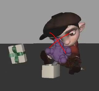
Also, watch out for sudden moves and spacing changes. If you flip back and forth between x111 and 112 and track his nose, you see how far up he goes. But flip between 112 and 113 and you'll see no up rotation, it's all sideways. Then from x113 to 114 the head suddenly goes down. Moments like that really take away from the weight of the head, plus your arcs are very flat that way (red) instead of round (green):


The finger wiggling moment after x129 feels a tiny bit too adult (like some evil mastermind), and not what a little kid would do, but that might just be me. Action wise, he moves forward, then the whole body stops and he does his finger wiggle and then goes for the box. It feels very separate and more like you hit that moment, then set random keys for the fingers, and then you continue. It would be great to have that moment more focused. He moves forward, does one little wiggle, then goes into a fist and brings his hands a bit closer to the body for more of an anticipation.

Then, when he puts his hands on the box, it looks more like a move, just motion, maybe constraining hands to the lid? It would be great to get more emotion out of that move. Is he trying to be delicate? Is he shy? Is he determined?

When that thing comes out of the box, I would actually have the head tilted the other way, and the thing come up a bit a straight. Reason being, right now the lid and the purple thing are covering his face, and you don't want to break eye contact with your character. Plus with this surprise, we, as the audience, want to know what the kid's reaction is, but we can't always see it because his face is covered.


Once he gets scared and turns around, the same happens spacing wise with his head. Quick moves, quick stops, etc. that take away from the weight and mass of the head.

The run at the end could have a bigger translation, meaning, he's really leaning forward, yet the amount of distance he covers is small. He looks like he's running really fast, but he doesn't get that far. :)

These are the main elements I would tweak for now. I hope the notes make sense. :)

JD

Sunday, July 15, 2012

Yuri Perrini - Suitcase - Critique


Hey,

that's a great first pass, you did a good job incorporating the reference into your poses.

Regarding your ending: I like the "breaking the handle" because it adds even more frustration to his already stressful situation! :)

There are some areas here and there that I would tweak for your next pass.

- timing wise: the "looking at the watch" transition to his reaction is too fast. It's very poppy and we need to be able to ready this moment:


- how the suitcase falls over to the left needs to be sold more. Right now it just happens, without any clear indication as to why; in your reference you take your foot off the lower part of the suitcase; so something similar would be good; or his knee bumps into it before he can grab it, etc.

- I think you can slow down the first pull from x166 on, so that it gives the suitcase more weight

 - when he kicks the suitcase, I'd stick to the reference a bit more in terms of balance; when you did it, it was more about trying to make the suitcase pivot over, but you weren't leaning all the way back in order to pull the suitcase; in your anim it doesn't look like he's trying to to make the suitcase pivot over enough, mainly because your kicks are very similar, so it feels more like a frustrated kick; in your reference you change position when you start kicking the second time, which brings nice contrast to the poses

- watch out for the last lift; your anim guy is too far back and the suitcase would have to move towards him due to the center of gravity (unless he has REALLY strong arms, which would be able to lift a super heavy suitcase straight up); in your ref your body is much closer to the suitcase:


whereas in your anim it looks like this:


If you look at your arms, the suitcase would have to move along the lines of the arms and not straight up.

I would work on those main areas first, but again, great first pass!!

Hope this helps!

And remind me, sorry, is it okay to post this online?

Cheers
JD

Saturday, July 14, 2012

Arthurnal - Cockroach - Critique


Hahahahaha, awesome change during the chair rotation! Love it! That pose is much more in character!

Alright, here my thoughts for the rest of the shot:

- the beats of him looking at his phone and then the cockroach work a lot better, it's much clearer now
- the head stretch at x20 is still too big, plus it's stretching in the wrong direction; with your current shape, he would be going down, but since he's going back, the head would stretch/drag horizontally, not vertically:


Either way, I would reduce that stretch by 30% and have it go along the red arrow
- I'd reduce the head stretch on x31 and 32 by 30% as well
- same stretching direction problem on x131; he's moving forward (horizontally), yet the stretch is vertical:


- I'd reduce the head stretch on x165 by 15% and the one on x245 by 30%
- when he goes forward from x142 to x154, the SL finger pose is the same; I'd start with what you have, but end up on x154 with the fingers flat, so that it looks like he's really stretching forward to grab the phone


- lastly, watch out for the SL hand spacing when it goes off the chair; on x99 it's on the chair, on x100 it's very far off, then from x100 to 101 it sticks in space (IK), then on x102 it goes back SR, and only then you have uninterrupted spacing, so ease out of that x99 pose more

Nice improvements, great job!!

JD

Thursday, July 12, 2012

Elena Dae - Jump and Cats - Critique

Alrighty,

let's look at the ballet clip first:


- you are pretty much done, there are only two things I'd tweak, and that's only because I'm picky. If you want to move on, you can, it looks great!!
1. I would bring the SR hand up earlier, at x72 (just like you have it at x74)


2. The SR hand flips down over two/three frames to x62 but then stops and it feels like that rotation down is very fast and stops very quickly; I would slow that down a bit more and ease into that stop a bit more:


That's it!! You did a really good job polishing this shot!

Now the cat shot:


shot1
- the grip around his neck is great, that feels very solid; x32 to 39 could be even tighter, if I'd be super picky (there seems to be a translate in the wrist from right to left and then up), but again, just being super picky
- It's pretty ouch out of frame, but just in case, make sure that her wrist is around his neck at x15
- I'd add a frame or two of cushioning on your pull up; meaning, if you track his right shoulder as he goes up, it goes up until x25 and then immediately down on x26 (you can also look at one of his strips for spacing)


- on x27, her left arm going SR hits a wall, settle that stop a bit smoother with some overshoot; right now it's too abrupt and makes it look stiff

and there's a little drift after that where the wrist and fingers slowly drift up; tighten that a bit more as well


shot2
- a lot better, I would do one more pass on spacing wise in his arms during the walk back; they feel a bit poppy throughout still, and that's because of one frame direction changes, for instances the SR arm on x79 goes up, then down on x80 while the body goes down as well; it's moving all as one piece instead of keeping the arm going up a tiny bit on 80 then a tiny bit down on 81 and then a bigger spacing change down; the same idea as in shot one when he gets pulled up and how he goes down over one frame

- same thing for the stumble and drop, he's really popping from x141 to 142

- watch out for the SL arm on x158; it looks like you're stretching the arms and then on x158 it pops into a bent pose

shot3
- her tail moving to the left at x238 looks like a linear key; it's moving very suddenly and very quickly, I'd slow that down a bit, at least ease out of that pose more

- I would separate the SR hand from the head for silhouette around x243


- from x255 on, when she moves forward, it would be great to drag her arms a tiny bit; it feels like everything is moving together, body and arms from x255 to x265
- there's a visual sticky thing going on with the SR arm from x260 to 265, where the forearm goes up in screen space but stuck on a rail, following the red lines I drew while the rest of the body moves around and on top of that you have the wrist rotating up; the wrist stands out because the forearm is so locked in that move


- this is a note I've made before and if you feel strongly about keeping it that way that's fine, but I think the last pose would be more balanced with the tail on the right side


With her leaning to the left, having the tail mirrored to the right feels a bit better; you had versions where the tail moved around and at first there were too many moves but now you're down to one and I think you can put one more in there so it ends up to the right, what do you think?

That's it! Down to super picky notes but it's looking really cool!

Cheers
JD

Saturday, July 7, 2012

Arthurnal - Cockroach - Critique


Alrighty!

So first off (again), the shot looks great, a lot of fun to watch!

Here my impressions:

- watch out on x6, the eye line suggests that he's already looking at the cockroach


Make it clear that he's looking at the phone; you can bring his head up for that:


That way you can have a clear head move, where he looks down, to show the audience that he's looking down and noticing the cockroach.

The stretch on the head is massive:


I would reduce those by 70%. With squash and stretch you want to feel it, but not see it. Right now, during all those moments, I can clearly see the head being stretched.

The only time it worked better, was around x165:


I would reduce the head by 30% and then it will work.

There's a moment that acting wise doesn't work for me that well. When he's on the chair, you have him almost look at the cockroach around x46, but then he slowly rotates around:


until he quickly snaps his head back SL (screen left) to look at the cockroach. What's confusing about this is that you're establishing how afraid of the cockroach he is, yet during that time he is turning his back towards his feared enemy and doesn't look at him for a long time. With that move and the quick head turn, which looks like "HA! I see you!", he come across as more confident and less scared. Yet once he gets up, he's still hesitant and scared. So you're breaking character here and it feels more like an animation moment that you had fun with, but didn't stay within character.

Another moment in that vein is around x185:


After he fumbles for the phone he lands has the cockroach right in front of him, and then doesn't move. If he's so afraid, I would have him take a quick step SL right after the landing. Or lift his left foot away from the cockroach. Anything that shows that he doesn't want to be near it.

Hope this makes sense!
JD

Tuesday, July 3, 2012

Robert Cristino - Flip - Critique


Hey,

that looks super cool! Really nice work! And I agree that the ending needs more work, but it's close!

First thing though, I'd need a frame counter. I will use the quicktime one, but that starts at 0. So if your shot starts at a different time, you'll have to do the math.

So overall, there's a lot of great detail work in it and nice complexities. Did you use any type of reference for that? I like the timing of the arms when he brings them up and how they go up and down a bit before he goes down for the jump.
It just feels like there was reference used or tweaked mocap up until he goes forward for the step. That feels keyframed without the same reference guidance.

But for the first part, I would offset the arms a tiny bit. The timing is great, but they both start and stop pretty much at the same time.

The biggest thing in terms of polish would be the knees. They feel a bit poppy in places. And watch out for transitions. If you track the knees back, they move screen left up until x37 and then the stop because the foot rolls kick in.

The knees get a bit wiggley around the x59 area. They really pop from 77 to 78, with more harsh direction changes around x82.

During the push off it would be cool to splay the toes a little bit. Not sure if there's a foot squash control.


On that first frame of the push off, the feet seem to move forward. Make sure they pivot off the toe:


I would also offset the legs by two frames when he brings them up. Right now they both move at the same time.

Watch out for the SL arm on x115 and 116:


The orientation is the same for two frames, after it went from left to right, then from x117 to 118 it moves screen left by a lot. Smooth out that transition so it's not so linear and poppy.

Now, the ending definitely needs more weight. You don't feel the step and how the step affects the body.
The timing of the settle is also too slow. He takes the step and goes down for a while, then comes back up in a slow manner. So that combined makes it feel too soft.
First thing you need to add is the weight shift in the hips:


The end pose feels a bit broken due to the direction of the hips and the chest. The hips are clearly pointing SL and the chest SR. I would rotate the hips around towards the chest a bit more.


To add some more oomph I would also make the SR foot plant at x160 sharper, which will help with the impact and weight.

For visual oomph you could hold the pose around x156 in his shoulders and arms, keep them up and instead of slowly relaxing them, keep them tight until x167 for a sharper release.

Hope this makes sense!
JD